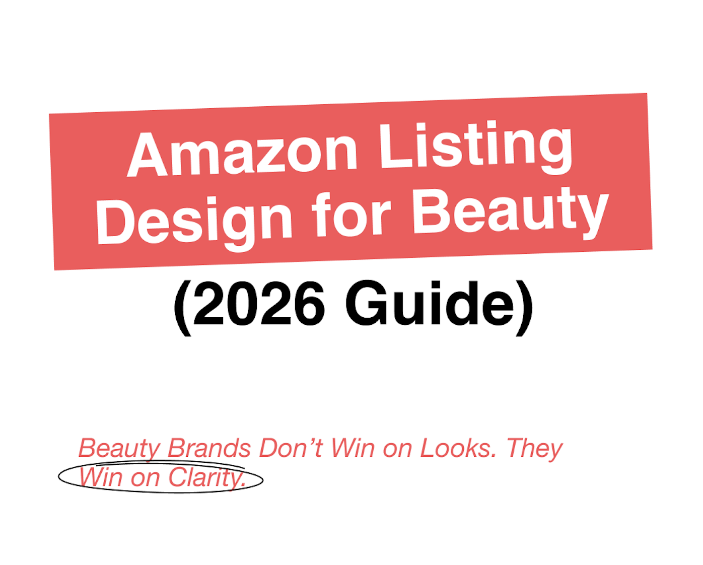
Design That Converts: How Amazon Visuals Drive Clicks, Conversions, and Brand Trust
In 2026, amazon listing graphic design is directly connected to performance metrics. A strong main image improves click-through rate. Structured gallery images improve conversion rate. A cohesive Store environment strengthens brand engagement and repeat behavior. When visuals are weak, paid traffic becomes expensive. When visuals are strategically structured, every click becomes more valuable.
For beauty brands especially, design must communicate three things immediately: why this product exists, how it feels, and whether it can be trusted. Texture visibility, ingredient clarity, and variation logic are not aesthetic preferences. They are conversion drivers.
Image Set Structure: From Scroll to Purchase
High-performing beauty listings follow a deliberate visual hierarchy. Without structure, even premium products appear generic. With structure, even new brands can compete confidently.
The image sequence should begin with a clean, compliant, scroll-stopping main image that remains clear at thumbnail size. Subtle differentiation through angle, depth, or controlled shadow often performs better than cluttered overlays. If shade or variant matters, the distinction must be visible before the click.
The second image should focus on the core benefit. This is the “why buy” moment. It should present one primary promise supported visually rather than overloaded with multiple claims. Clarity outperforms exaggeration, particularly in regulated categories such as supplements and skincare.
Next, the gallery should move into texture and ingredient visuals. Beauty is sensory, and shoppers need to see cream consistency, serum viscosity, pigment payoff, or finish type. Ingredient highlights should be simplified and presented in a visually digestible way. Overly technical explanations or crowded layouts reduce trust rather than build it.
Usage visuals should then clarify how the product integrates into a routine. Showing when and how to apply reduces friction and supports conversion. A structured comparison or differentiation image can follow, helping position the product without aggressive competitor references.
The most common mistake is trying to communicate everything at once. When benefits, ingredients, badges, and claims compete visually, trust decreases. Clear hierarchy builds confidence.” -Graphic Designer, Yuliia Hurenko
Before finalizing any gallery, we review it internally against a structured image set checklist. We confirm that the main image is readable at thumbnail scale, that the benefit image answers the primary purchase question, that textures are clearly visible, that ingredient visuals are simplified, and that the overall sequence follows a logical problem-to-solution flow.
Variation and Shade Logic: Removing Decision Friction
Beauty listings often fail not because of weak branding, but because of variant confusion. Shade systems, skin-type variations, or functional differences introduce complexity. If a shopper hesitates because they are unsure which version fits them, conversion declines.
Variation logic must be intuitive at both thumbnail and PDP levels. Shade names should be consistent. Swatches must be clearly visible and realistic. Thumbnails should look visually distinct rather than nearly identical. For skincare variants such as dry, oily, or sensitive skin, a consistent design template with subtle color differentiation helps shoppers immediately understand the difference.
If the customer has to think too long about which option is right for them, they postpone the purchase. Our role is to remove that mental effort.”-Graphic Designer, Yuliia Hurenko
This clarity must extend into the Store. If variant organization is clear on the PDP but confusing in navigation, the brand experience feels fragmented. Structured amazon brand store optimization ensures that shade groupings, routines, and product categories mirror the clarity established in listing images.
A+ Modules: Story, Proof, and Routine Integration
A+ content should deepen trust and extend engagement, not repeat the gallery. For beauty brands, A+ works best when it follows a structured narrative.
The opening module establishes positioning and lifestyle context. This creates emotional alignment. The next modules clarify ingredient transparency and formulation logic using simplified infographics. Texture visuals and benefit reinforcement then strengthen credibility. Finally, routine integration demonstrates practical application.
Shoppers rarely read long blocks of copy in A+. They scan visually. Clean layouts, consistent typography, and restrained messaging outperform crowded modules. The goal is to remove doubt and reinforce positioning, not to overwhelm.
Our A+ checklist ensures that each module serves a distinct purpose, that ingredient visuals remain compliant and accurate, that routine explanations reduce hesitation, and that visual consistency matches the PDP. When A+ supports the listing structure instead of duplicating it, conversion stability improves.
Store Flow: Building a Cohesive Brand Environment
The Store should function as a structured brand environment rather than a simple product catalog. In beauty categories, it works best when organized around concerns, routines, or collections rather than random product grids.
A strong Store begins with a clear hero message aligned with the brand’s core positioning. Navigation should be intuitive, whether organized by skin concern, routine stage, or product type. Each section should visually reinforce the same brand identity present in listing images and advertising creatives.
When traffic comes from Sponsored Brands or external campaigns, the Store must feel like a continuation of the same brand world, if it feels disconnected, trust weakens.”-Founder, Andrejs Klimovskis
Our amazon storefront design services follow a structured review process. We assess hero clarity, navigation logic, visual consistency, and cross-sell opportunities. A cohesive Store strengthens brand perception and supports repeat purchases.
Before and After: What Actually Changes
Before optimization, beauty listings often contain overcrowded overlays, inconsistent fonts, unclear benefit hierarchy, and confusing shade thumbnails. Ingredient visuals may be either overly technical or too generic. The listing appears busy but unconvincing.
After structured redesign, the improvement is not about adding more elements. It is about removing confusion. The main image becomes cleaner and more differentiated. The benefit image becomes focused and singular. Texture visuals feel realistic. Shade logic becomes intuitive. A+ modules reinforce trust without repetition.
Conversion improves not because the design became more decorative, but because it became clearer.
The 2026 Beauty Design Checklist
Before launch or redesign, every beauty listing should pass a final design review.
We confirm that the primary benefit is visible within the first two images. We ensure that the gallery follows a logical problem-to-solution structure. We verify that textures and finishes are clearly shown. We review ingredient visuals for clarity and compliance. We evaluate variant thumbnails for distinctness and consistency. We confirm that A+ adds depth rather than repetition. We assess whether the Store navigation mirrors PDP clarity and supports logical browsing flow.
Only when image structure, variation logic, A+ modules, and Store flow align does the listing function as a cohesive conversion system rather than a collection of visuals.
Final Perspective
In 2026, beauty brands cannot treat amazon listing graphic design as a cosmetic finishing step. It is foundational performance infrastructure. Strategic amazon design services, structured amazon storefront building service execution, and disciplined amazon brand store optimization ensure alignment across click-through rate, conversion rate, and long-term brand perception.


.png)


.jpg)


.jpg)
.jpg)

.jpg)