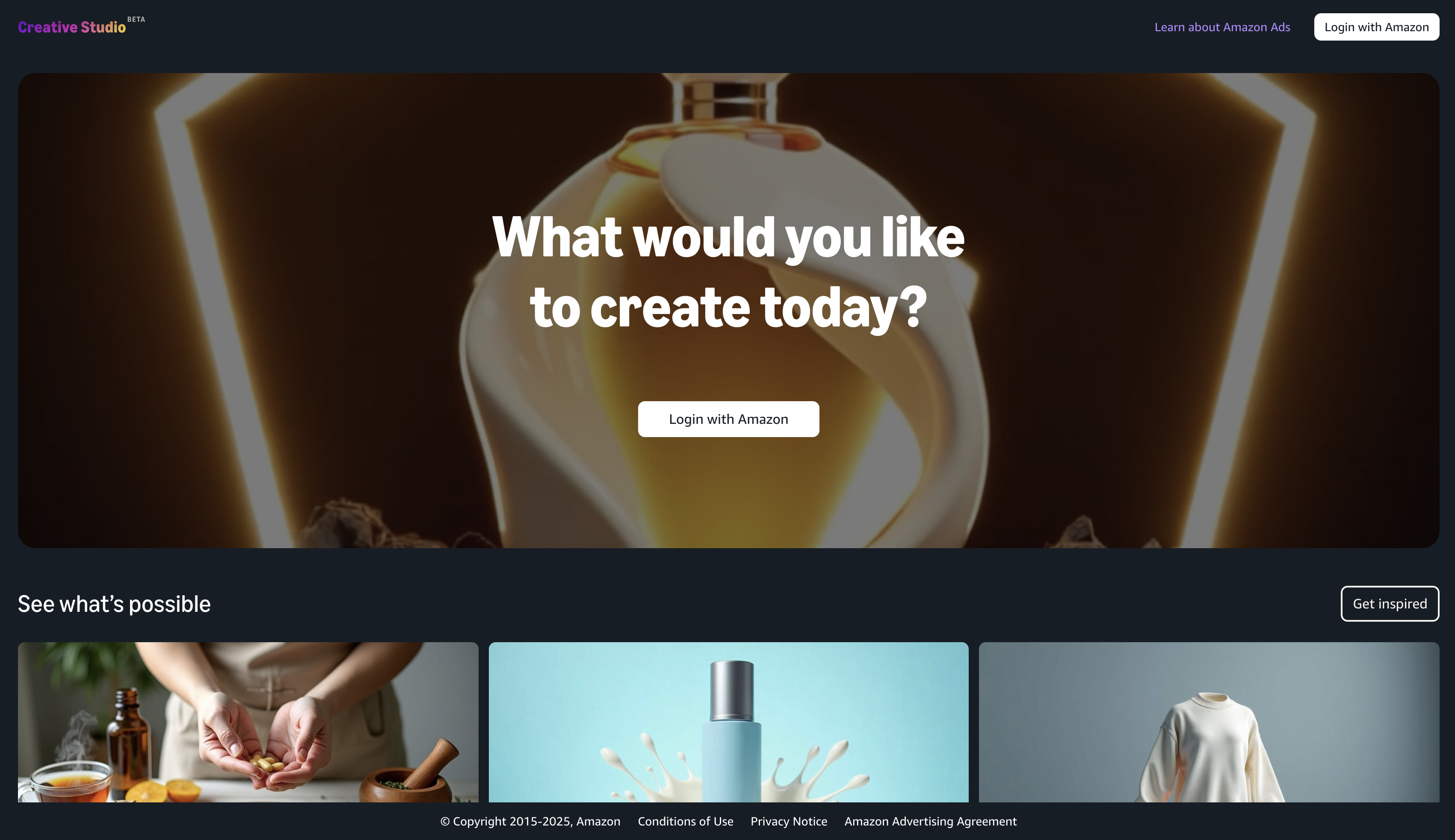
Increase your ROAS and conversions by adding these simple changes to your product listing images. 7 years of A/B tests in one e-book. Get expert tips to optimize your listing and boost your sales - all in our FREE e-book!
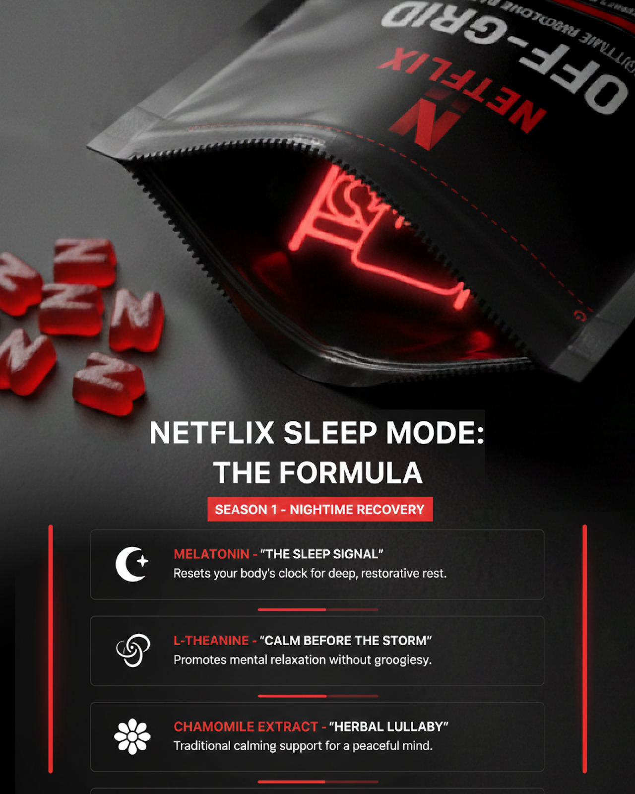
What if Netflix Launched “Sleep Mode” Supplements on Amazon? (2026 Concept + Compliance Notes)
What if Netflix launched a sleep supplement on Amazon? This creative showcase by INNELS explores how strong branding, strategic packaging, and Amazon-first thinking can transform a simple product into a high-converting, scroll-stopping experience.
Mark Daniel Zalomajev
Founder
How the INNELS team created a creative showcase at the intersection of randing and e-commerce
Sometimes the best way to demonstrate expertise is not to talk about it, but to show it through a bold and slightly provocative example. That is exactly how the concept was born at INNELS: What if Netflix entered Amazon with its own sleep supplements?
This is not a real product launch and not a commercial commission. It is a creative showcase fully conceptualized and executed by our team — from strategic hypothesis to visual system and packaging design. Through this project, we wanted to demonstrate what a product can look like when you think not in terms of “selling melatonin,” but in terms of building a systematic brand that understands Amazon, consumer behavior, and conversion logic.
The idea: not a product, but a ritual
We did not start with design. We started with a question. Why does the sleep supplement category on Amazon look so similar across the board? Why are most listings simply variations of fruity bottles overloaded with claims but lacking personality?
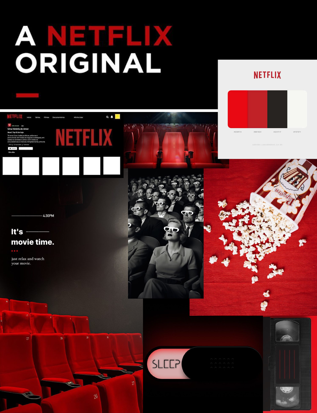
At the same time, we looked at Netflix — a brand that understands habits better than almost anyone. Netflix does not just stream series. It creates rituals: “one more episode,” “season finale,” “I’ll finish it tomorrow.” It is embedded in the daily behavior of millions of people.
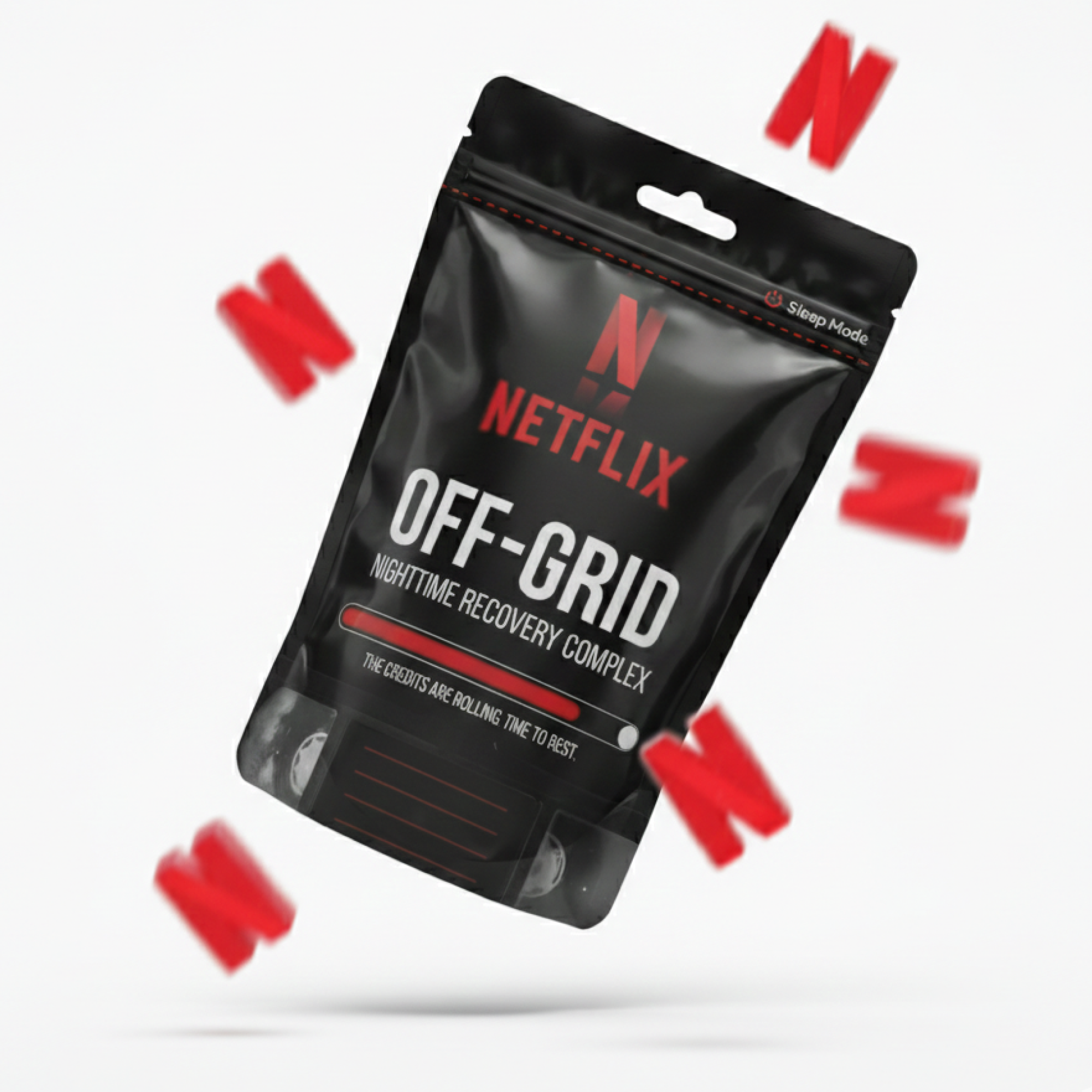
This led to a simple but powerful concept: if the day is a season, the evening is the final episode. And sleep is the credits. In that logic, supplements are not just “sleep pills,” but the button that ends the season for your body.
We deliberately shifted the focus from the product to the feeling. This is not about melatonin. It is about the closing moment of the day — a smooth transition from watching to resting. Even the flavor, popcorn, was chosen intentionally. It reinforces the cultural association with a Netflix evening and strengthens the ritual element.
The visual system as an extension of the Netflix interface
The design was built around atmosphere rather than packaging alone. We created a mood board, explored Netflix’s color system — red, black, shades of grey — and translated it into a physical product format. It was important that the visuals did not feel like a parody, but like a natural extension of the platform’s interface language.
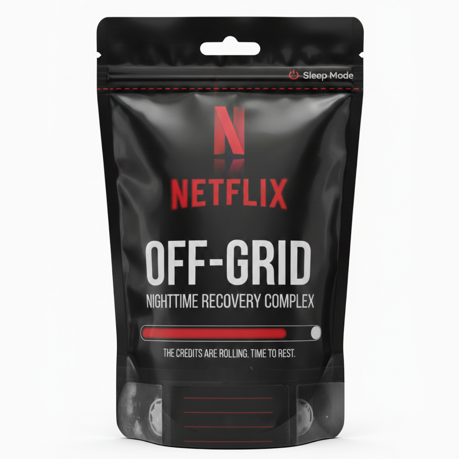
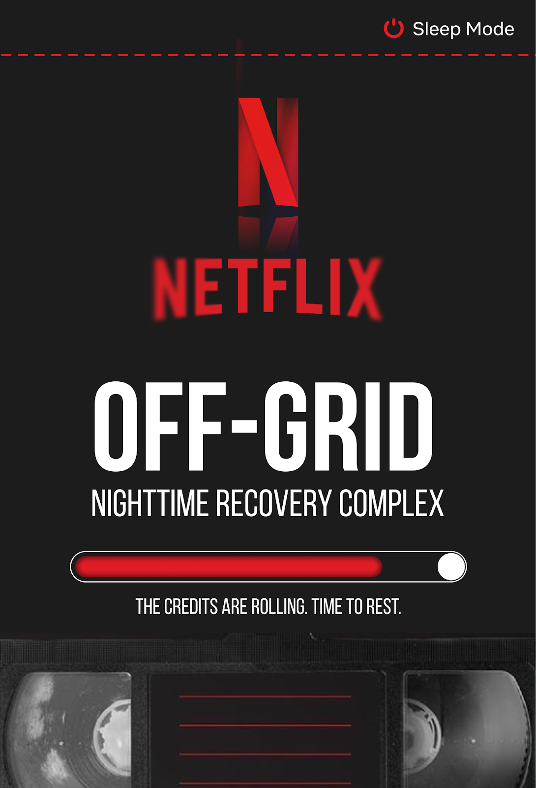
That is why you see progress bars, timeline elements, episode-style ingredient cards, and minimalistic compositions. Even the presentation of the formula was reimagined. Instead of a dry ingredient list, we structured it like a series of episodes, each explaining the function of the product.
The goal was not simply to design attractive packaging. The goal was to build a cohesive visual system that could function as a real brand.
Packaging as part of strategy
We paid special attention to the packaging format. We intentionally avoided the typical screw-cap bottle associated with pharmacy products. Instead, we chose a format that is practical, portable, easy to use, and visually aligned with a lifestyle product.
On Amazon, packaging is not a secondary detail. It directly influences perceived value. When a product looks like “just another supplement,” it competes on price. When it looks like a thoughtfully designed brand, it competes on perception and differentiation.
N-shaped gummies: not decoration, but a differentiation tool
One of the strongest elements of the concept is the gummies shaped as the letter N. This is both a direct reference to Netflix and a powerful visual anchor that differentiates the product instantly.
Interestingly, the shape can also resemble inverted “Z” letters — the classic comic symbol for sleep. This layered meaning strengthens memorability and reinforces the central idea.
On Amazon, attention is measured in fractions of a second. A strong visual hook is not aesthetic luxury — it is a performance tool.
Why this is not just a beautiful image — it is Amazon logic
It is important to emphasize that this project was not created as an abstract design experiment. It was built with a clear understanding of what actually works on Amazon.
First, we analyzed the category. Most sleep supplement listings look visually similar. To increase CTR, the main image must stand out while remaining clean and instantly readable. That is why the composition is structured to ensure immediate clarity, strong color contrast, and a recognizable silhouette.
Second, we thought about conversion. Information is structured logically and emotionally. The formula is presented as a narrative rather than a list. The usage instructions are framed as a ritual rather than a technical description. This approach increases engagement and supports decision-making.
Third, we considered perceived premium positioning. The black-and-red palette, minimalism, and refined typography create a brand impression rather than a commodity feel. On Amazon, brands with a clear system and visual consistency are far more likely to escape pure price competition.
A beautiful image alone does not sell. What sells is understanding how users scroll, how they make decisions, what stops their eye, and what builds trust. This concept was built with that professional mindset.
What this means for Amazon sellers
This project is not about Netflix, and it is not about sleep supplements. It is about thinking differently.
An Amazon listing is not just a collection of images. It is a system. The main image is not just packaging photography — it is a strategic attention tool. A+ content is not just blocks to fill — it is an opportunity to tell a story that increases conversion.
When a product is packaged strategically, it stops being “one of many.” It starts defining its own perception category.
If this idea resonated with you
If this creative concept caught your attention and you see potential for your own brand, it means you are already thinking beyond standard packaging.
At INNELS, we do not just create visuals. We develop packaging strategies that drive growth. We know how to position your product so it stands out in search results, increases CTR and conversion rate, and ultimately drives sales — not just looks good.
If you want to package your brand in a way that truly moves the needle on Amazon, we would love to talk. Feel free to reach out to us here.


.png)


.jpg)


.jpg)
.jpg)

.jpg)